by Ron Cruz
Business Intelligence has changed. There are new disruptive technologies, the cloud, and a paradigm shift that is putting more power into the hands of users instead of IT. More competition has allowed companies that have never had a chance to get into business intelligence to enter into the world of BI. Competition has also led to more functionality to make true the promise of Business Intelligence.
Yet, for all the change that is occurring it is important to remember the basics and as I say, "Mind your Grammars"
The Grammars of Business IntelligenceThere are three, what I call, "Grammars" to business intelligence:
- Data Architecture
- Visual Grammar
- Process Grammar
The Data Architecture Grammar is largely beyond the scope of this post. Between Imon and Kimball and other prominent thinkers on the subject of data architecture, while interesting and important, is largely settled for many users and is the property of the data architects in their ivory towers. What interests me the most currently are the Visual and Process Grammars. These are grammars that are moving more and more to the users. Users who, until recently, have largely not been engaged in the conversations building these.

The Visual Grammar
There has been a lot of good conversation about the visual grammar and the science behind visualization in the last few years. And its good that people are talking about it. Yet, at times it seems that these discussions are mainly left for people like myself to proselytize the value of a visual approach to Business Intelligence. What is the most widely used Business Intelligence tool in the world? Microsoft Excel. What's the least effective way to get insight out of your data? Microsoft Excel. I often see companies spend a lot of time and resources on their Business Intelligence Platforms only to replicate excel. There is a better way. Data is a visual language, not a written one. And now users finally have the tools to engage in visual conversation. But in order to engage in a conversation you need to have a proper grammar. Can you understand someone with bad grammar? Absolutely. It just takes a lot longer and is usually confusing. A proper use of visual grammar helps ensure that data conversations are effective and clear. That being said, it is important to discuss the elements of visual grammar.
Position
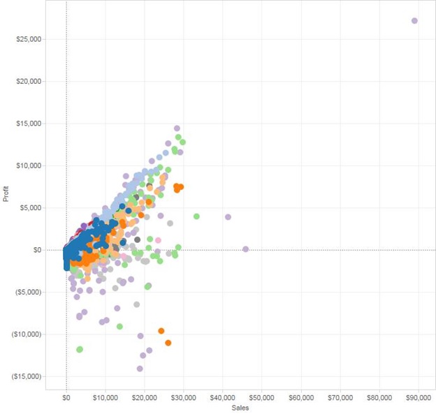
The eye sees position first. This is why scatter plots are so prevalent when comparing numbers. The eye automatically goes to the outliers.
Position is also used very effectively in bars. Here you can instinctively see that the rubber bands are selling poorly compared to the rest of the items.
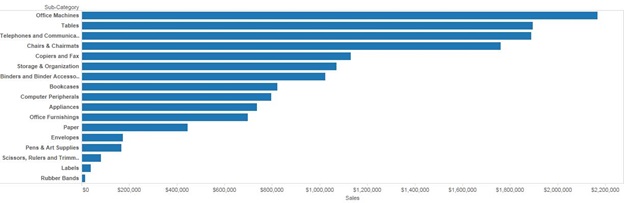
It is important not to confuse the bar's position with size. Yes, bars with greater values extend farther than a bar with a lesser value. However, both bars are the same width.
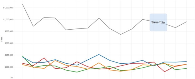
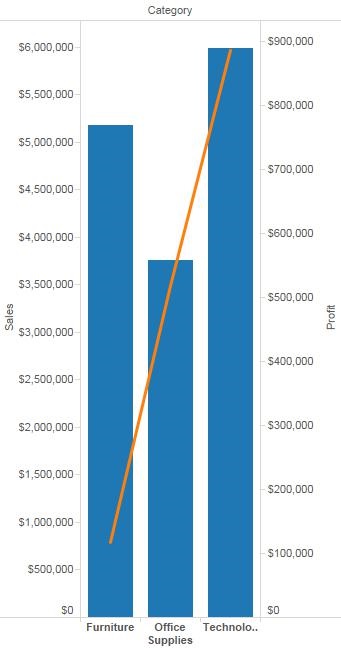
Positions is also very effective to not the difference between two different values. Here you can see the sales by category at the same time as the total. Usually people would create a pivot table that would have the total by category as a separate line. That takes time to read, and interpret. Here the two numbers are shown side by side visually using Position.
Color
There is debate as to whether the eye sees color or shape after position. Both are effective but let's cover proper color use first.
First there's the obvious Red = Bad, Green = good usage. This is great for when there are 3-5 possible categories for a metric. 5 if you use intermediate colors. Any more intermediate colors, I find that more than 5, leads to confusion and delay. These elementary color assignations are very useful. Nothing really gets an executive's attention quicker than red on a dashboard.
That being said, its important not to overuse the Red/Yellow/Green pallet. Only use it when appropriate and avoid what I call The Syndrome Syndrome (when everything is important, nothing will be).
Use color pallets to encode data categories. Think of color (or any visual element) as a way to layer information on top of each other. Here is a basic question, how are departments doing against each other, at a sub-department level. Here we have used size to denote the overall amount of sales by sub department and then used color to denote category.
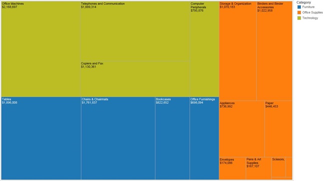
This use of color makes it easy to see that the technology department is outpacing the furniture department and office supplies is lagging behind. Be careful that if you are using multiple visualizations on one page that color means the same thing throughout, you do not want one color to signify one thing on one visualization and another in another visualization.
It is useful to know your color wheel. I know it sounds silly but contrasting colors do more than simply make a visualization look pretty. Contrasts call attention. For example this visualization is readable.

But this one is much easier to read.
Know your contrasts and use them to your advantage.
Shape
Shape is another layer that can be used to convey insight. That being said there are certain things that color does better than shape. For example, this scatter plot from earlier
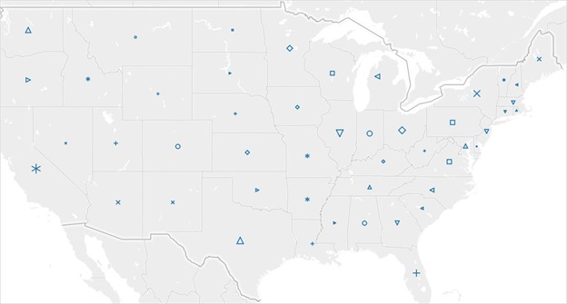
Is far easier to read than using shapes
When there is overlap, it is generally better to use color instead of shape. Also when looking for groupings of data color tends to be better. For example:
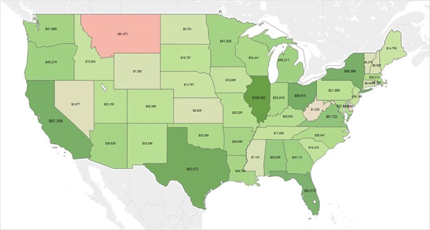
This map shows that the west coast is doing pretty well, while the mountain west is not doing as well.
But it is hard to read. Using color it is far easier.
All this isn't to denigrate shapes, they are very useful. It's just that there are things that color does better.
Using shapes as an additional layer of information can be incredibly useful.
While a little busy this visualization shows the percentage change week over week by Item Department with the departments show as shapes.
Since there is a lot going on here shapes are a better choice than color because using color can lead to overlaps and a bit of visual overload.
Another thing to keep in mind with shapes is to mind how many possible shapes someone can interpret without having to go back to check the legend.
Size
Size is a bit tricky. While it can be very useful as even an additional layer of data information, it can be difficult to be precise when precision is needed.
For example what's the biggest segment here?
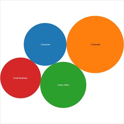
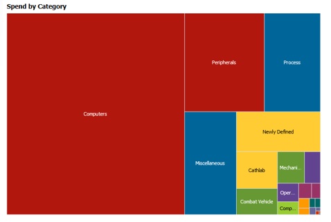
Obviously the Corporate segment. But what is the second biggest? Not so easy to tell. When it comes to size, intent really matters. If the intent was to show at a high level which segment was leading to the most business this visualization is just fine for that. Do you want to be detailed? Well, this doesn't work as well. Sure, you could show the values in the bubbles, but at that point you're losing the value of visual grammar. A good use of size is the treemap I had shown earlier that's a very powerful way to convey percentage of a whole. Another is something like below.
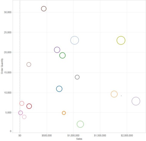
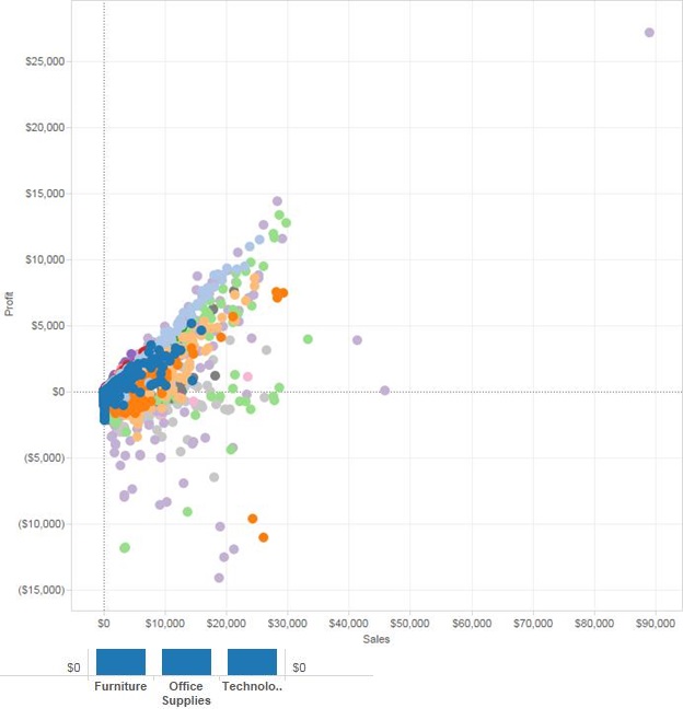
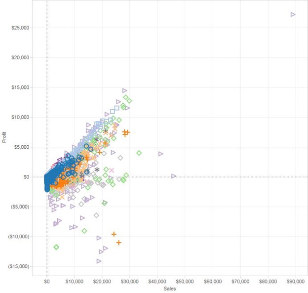
This scatter plot shows the amount of Sales along with the Ordered Quantity. The circles are shaped by profit. Here size is used to convey another layer of information.
Reading Direction
When building something keep in mind how people read. Pie charts and gauges, while pretty, are not visually useful. Why?

Consider using treemap or a bullet graph or a stacked bar before entertaining the thought of using a pie or a gauge as they usually can only convey one thing, and even at that they do not do it efficiently.
Avoid Double Encoding
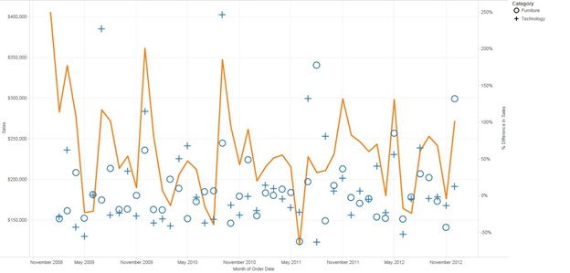
Double encoding is using more than one visualization element on a data point. Here's an example: The below visualization shows sales by month with the % change overlaid in the form of circles and sized by the % of change.
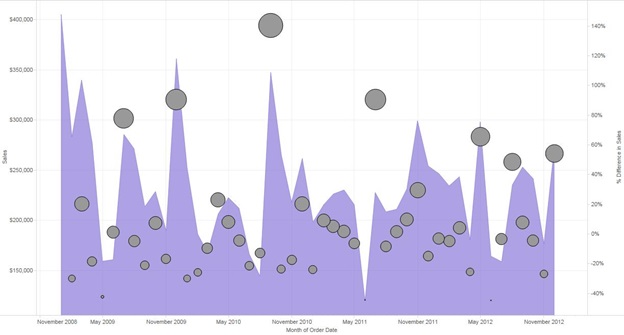
While this looks fine, notice I already encoded the % change by position (the higher the change the higher the circle) I have no need to encode it again by size. Doing so makes the user have to interpret the data twice.
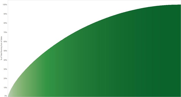
That is not to say that there's not a place for double encoding. I've seen a few visualizations that use it to pretty good effect but they're usually purely cosmetic in nature. For example a pareto just looks better with a double encoding of the % of total by color. However, it isn't necessary to understand the data. The key take away is to use double encoding sparingly and judiciously.
Process Grammar
Process grammar is far more difficult to explain as it will be different per company. The main idea behind good process grammar is to guide the user to insight. The key word there being guide and not drive. Insight cannot be driven, but it can be guided. Therefore, it is important to have an easy workflow to your visualizations that enable good process grammar. And it is of utmost importance to marry good process grammar to good visualization grammar for greatest effect.
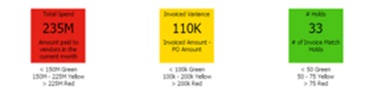
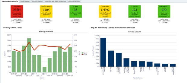
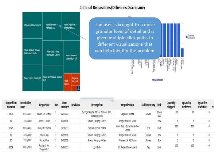
It is easier to show proper process grammar than it is to explain it. Here is an example from KPI's Cloud Analytics for Procurement and Spend.
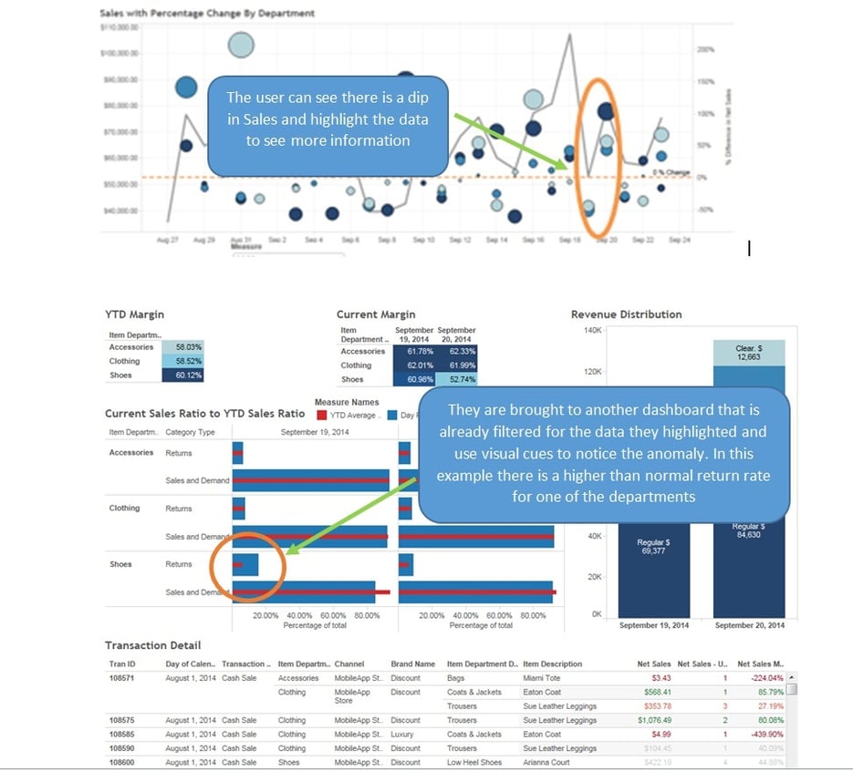
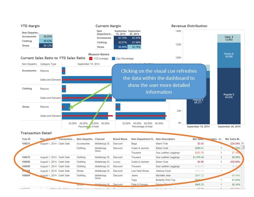
Here is another example of visual grammar paired with process grammar from KPI's Cloud Analytics for Retail.
The tools exist now to make visualizations very pretty. But pretty must not be the enemy of useful. Thought must be taken to give the users a journey through their data and not just a picture of it.
Business intelligence has changed and has given users more power over their own data journey. If people are reminded to keep to good visualization and process grammar hopefully business intelligence will have changed for the better.
Ron Cruz is a Solution Architect and Project Management Professional (PMP) at KPI Partners, specializing in business intelligence tools and applications. Check out Ron's blog at KPIPartners.com.