by Ranjeet Mandal
Visual Interactivity in a Power BI Report
This is the first post in KPI's Power BI blog series. In this blog, we provide a high-level overview on visual interactivity in a Power BI report. You can read the other posts in the series here:
- Dynamic Selection of Measures in Power BI
- Security and Collaboration in Power BI
- What is PowerShell and Connect to Power BI Service
- Dataset refresh and other dataset operations from PowerShell
Power BI visuals in a report page are interactive among each other, by default. An item selection in a visual impacts the rest of the visuals by highlighting the related items. However, do we get the required clarity in visualization? What if we need to display Totals, which should not be impacted by selection in any other visual?
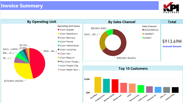
Let us build few visuals on our invoice data
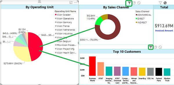
When we select an item in the first visual, the related items in the second and third visuals get highlighted as shown below.
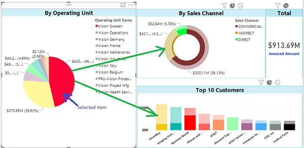
In the above report, Operating Unit Vision Sweden is selected in the first Pie Chart, and related values in second and third charts get highlighted.
However, the second and third Charts lack clarity. It is hard to visualize which items got selected. To improve the readability, instead of highlighting in the pie chart, we can use filter to have better insights.
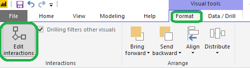
How to change the interaction?
To change the interaction of a chart with other charts on the report page, select the chart for which you want to control the impact on other charts, and then from Visual Tools menu, under Format, click on Edit Interactions.
All other visuals in the page will appear with two or three buttons (Interaction control buttons) on the top right-hand side corner of each.
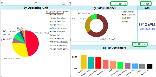
The darker colour in this icon set shows which interaction will apply.
Let's change this interaction to Filter. See the difference in second and third visual after an item selection in first visual. Doesn't it make more sense, better visual appeal as well?
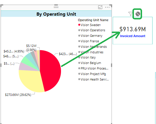
The interactivity can be set to None as well which helps us in case we want Totals in a visual.
Invoiced Amount when there is no selection in the first visual
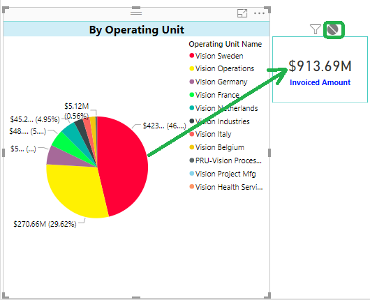
The impact on Invoiced Amount when there is an item selected in the first visual No Impact!
Check out our case studies to see how we've helped our clients:
Masterlock
Williams Sonama
Do you enjoy the solving technology problems and helping people meet their data analytics challenges? Maybe you would be a good fit for our team. See our job openings.
Ranjeet Mandal is a Principal Consultant at KPI Partners. He has worked extensively on reporting tools like Power BI, Tableau, QlikView, and OBIEE. In addition to his reporting experience, he has extensive experience on ERP technologies like Oracle JD Edwards, EBS, and NetSuite. He has implemented Real-Time Reporting of various JDE modules across multiple on-premise as well as cloud platforms.