by Ranjeet Mandal
Dynamic Selection of Measures in Power BI
This is the second post in KPI's Power BI blog series. In this blog, we will discuss the dynamic selection of measures in Power BI. You can read the other posts in the series here:
- Visual Interactivity in a Power BI Report
- Security and Collaboration in Power BI
- What is PowerShell and Connect to Power BI Service
- Dataset refresh and other dataset operations from PowerShell
Have you ever needed to use slicers in Power BI to choose a measure to be displayed in your charts? We know that the default functionality of Power BI slicers is to allow us to choose from the available dimension or measure values. But what about the ability to choose which measure to be displayed?
Let us first discuss the use case
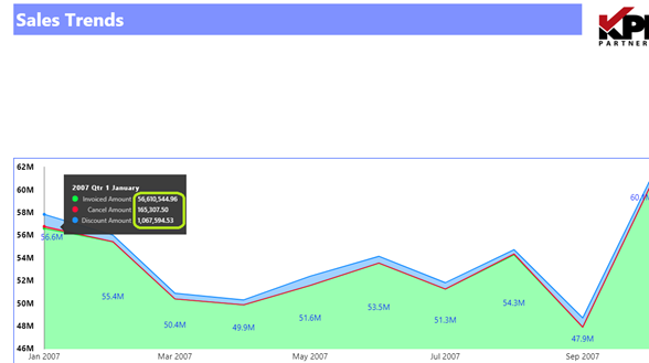
When multiple measures are required to be displayed on the same chart, the axis may not able to support all the measures at once.
For example – when we consider Invoices against Discounts and Cancellations we observe a wide gap among the values of the measures. Invoices usually are 10-100 times higher than cancellations and discounts. Observe the below chart. Relate all the three measures to the Y-axis. Does it make sense? No.
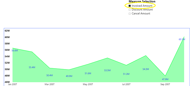
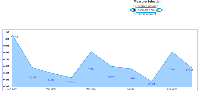
Now let’s see what we can achieve with Slicers to choose the measure on the chart.
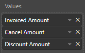
Invoiced Amount
Discount Amount
Cancel Amount
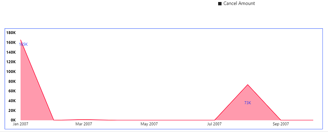
Does it make sense? Yes. The Y-Axis changes with the chosen measure.
Point to be noted is all three measures could be plotted on different charts but then we will be sacrificing on the real estate of the report page and it won’t be helping the aesthetics of reporting as well.
Let us see how we can enable slicers to help users in choosing the measure to be displayed
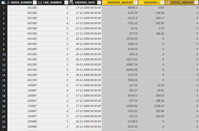
Let us start with our Fact table - KPI_BBB_FACT. It has Order details and each order line has few measure columns – INVOICED_AMOUNT, DISCOUNT_AMOUNT, CANCEL_AMOUNT etc.
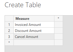
We need to create a slicer which can hold the measure dimensions. We create a table manually within Power BI using the 'Enter Data' button. This table will have a single column called Measure with column values of the three measure names we want to slice over.
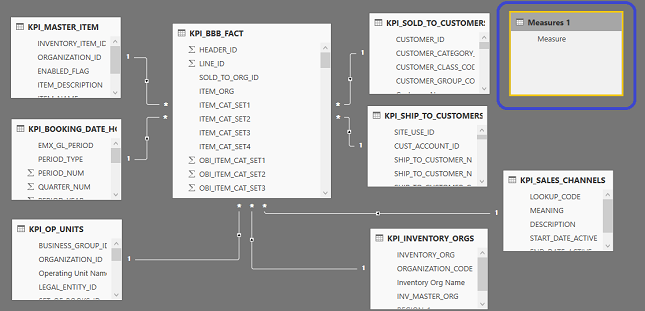
This table must not have a relationship to any other table. However, without a relationship, slicers won’t work as required. What should be do about that? We will see next.
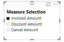
Now, let’s create a slicer using the Measure table dimensions.
Next, we need to create measures that are related to the measure dimensions in our Measure table. We use the CONTAINS() dax function to create the following measures:
Invoiced Amount = IF(CONTAINS('Measures 1','Measures 1'[Measure], "Invoiced Amount"), SUM(KPI_BBB_FACT[INVOICED_AMOUNT]), BLANK())
Discount Amount = IF(CONTAINS('Measures 1','Measures 1'[Measure], "Discount Amount"), SUM(KPI_BBB_FACT[DISCOUNT_AMOUNT]), BLANK())
Cancel Amount = IF(CONTAINS('Measures 1','Measures 1'[Measure], "Cancel Amount"), SUM(KPI_BBB_FACT[CANCEL_AMOUNT]), BLANK())
The last step is to rebuild our charts replacing the original measures with the above defined ones.
That’s it. We get our final chart.
Check out our case studies to see how we've helped our clients:
Masterlock
Williams Sonama
Do you enjoy the solving technology problems and helping people meet their data analytics challenges? Maybe you would be a good fit for our team. See our job openings.
 |
Ranjeet Mandal is a Principal Consultant at KPI Partners. He has worked extensively on reporting tools like Power BI, Tableau, QlikView, and OBIEE. In addition to his reporting experience, he has extensive experience on ERP technologies like Oracle JD Edwards, EBS, and NetSuite. He has implemented Real-Time Reporting of various JDE modules across multiple on-premise as well as cloud platforms. |