

The experts at KPI Partners have completed a marathon schedule of webinars from the end of October through December. In the event you...

The experts at KPI Partners have completed a marathon schedule of webinars from the end of October through December. In the event you missed an event, a recording from each of the webinars have been posted to the KPI Partners webinar archive.
by Kurt Wolff
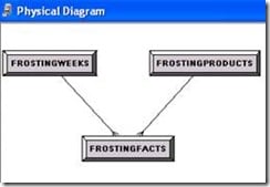
One of the questions that comes up over and over again is how to show all periods in a query when facts don’t exist for all...
by Kurt Wolff
One of the questions that comes up over and over again is how to show all periods in a query when facts don’t exist for all periods or how to show all products when facts don’t exist for all products.
by Kurt Wolff
[Note: the following discussion is based on OBIEE version 10.1.3.4.0 and Oracle XE version 10G, both running on Windows. The...
by Kurt Wolff
[Note: the following discussion is based on OBIEE version 10.1.3.4.0 and Oracle XE version 10G, both running on Windows. The behavior of other versions of OBIEE could be different.]
by Kurt Wolff
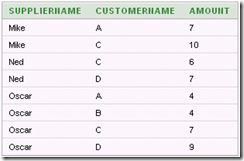
Here’s a not uncommon scenario. You are designing a dashboard page with a report such as sales by customer. To show sales by...
by Kurt Wolff
Here’s a not uncommon scenario. You are designing a dashboard page with a report such as sales by customer. To show sales by customer, you design a report containing the CustomerName column so that facts are grouped by customer. You provide a multi-select prompt to allow the user to select which customer data to view. But you also want to provide the ability to view the data for all customers as a total, without grouping by customer.

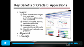
KPI Partners has developed a pre-built analytic application specifically designed for manufacturing and costing processes.
Minneapolis,...
KPI Partners has developed a pre-built analytic application specifically designed for manufacturing and costing processes.
Minneapolis, Minnesota – November 17, 2011 -- KPI Partners today announced the introduction of Manufacturing Analytics for Oracle BI, a solution developed for use with the Oracle Business Intelligence platform and the Oracle E-Business Suite Manufacturing modules. KPI’s Manufacturing Analytics enable any organization to monitor and analyze the manufacturing processes and costing details that exist within an organization.
by Kurt Wolff
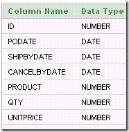
Here is a technique for enabling the user to set join columns with a dashboard prompt.
by Kurt Wolff
Here is a technique for enabling the user to set join columns with a dashboard prompt.
by Kurt Wolff
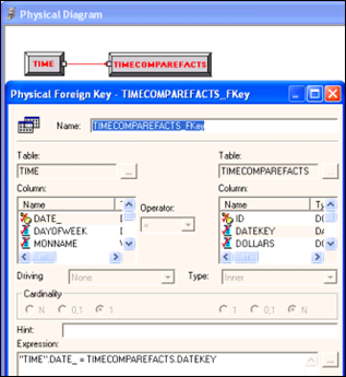
The Ago() “time series function” can be used to show data for a previous time period, as long as the previous time period...
by Kurt Wolff
The Ago() “time series function” can be used to show data for a previous time period, as long as the previous time period corresponds to a level that has been defined in the period hierarchy. A typical period hierarchy containing day, month, quarter, and year levels would allow you to use the Ago function to construct measures showing data for day ago, month ago, quarter ago, year ago (or N days ago, N months ago, etc.).
by Kurt Wolff
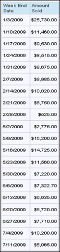
Someone asked a question on a “Siebel Analytics” email group a few days ago that I thought was worth discussing briefly...
by Kurt Wolff
Someone asked a question on a “Siebel Analytics” email group a few days ago that I thought was worth discussing briefly here. The question posed was how to put a date prompt on a dashboard and return data for that date and the next 30 days. The solution could not involve presentation or report variables, since these were introduced only in a later version of Siebel Analytics that the person who posed the question did not have.
by Kurt Wolff
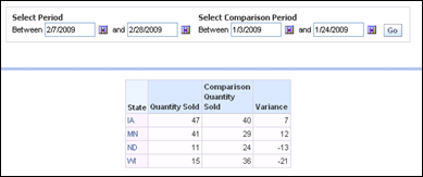
There are times when you might want to visually present data directly in tables or pivot tables rather than create a chart...
by Kurt Wolff
There are times when you might want to visually present data directly in tables or pivot tables rather than create a chart view. For example, you may have too many values to show in a chart. Or the number of values returned by the query might vary, making the size of the chart sometimes too small to accommodate them all, sometimes too large. Or you may want to visually scroll up and down a table to compare values and would like a visual representation right there in the table.
The team of Sid Goel, Kusal Swarnakar, and Sid Singh collaborated on a webinar last week that covered the much misunderstood subject of...


The experts at KPI Partners have completed a marathon schedule of webinars from the end of October through December. In the event you missed an event, a recording from each of the webinars have been posted to the KPI Partners webinar archive.
by Kurt Wolff
One of the questions that comes up over and over again is how to show all periods in a query when facts don’t exist for all periods or how to show all products when facts don’t exist for all products.
by Kurt Wolff
[Note: the following discussion is based on OBIEE version 10.1.3.4.0 and Oracle XE version 10G, both running on Windows. The behavior of other versions of OBIEE could be different.]
by Kurt Wolff
Here’s a not uncommon scenario. You are designing a dashboard page with a report such as sales by customer. To show sales by customer, you design a report containing the CustomerName column so that facts are grouped by customer. You provide a multi-select prompt to allow the user to select which customer data to view. But you also want to provide the ability to view the data for all customers as a total, without grouping by customer.
KPI Partners has developed a pre-built analytic application specifically designed for manufacturing and costing processes.
Minneapolis, Minnesota – November 17, 2011 -- KPI Partners today announced the introduction of Manufacturing Analytics for Oracle BI, a solution developed for use with the Oracle Business Intelligence platform and the Oracle E-Business Suite Manufacturing modules. KPI’s Manufacturing Analytics enable any organization to monitor and analyze the manufacturing processes and costing details that exist within an organization.
by Kurt Wolff
Here is a technique for enabling the user to set join columns with a dashboard prompt.
by Kurt Wolff
The Ago() “time series function” can be used to show data for a previous time period, as long as the previous time period corresponds to a level that has been defined in the period hierarchy. A typical period hierarchy containing day, month, quarter, and year levels would allow you to use the Ago function to construct measures showing data for day ago, month ago, quarter ago, year ago (or N days ago, N months ago, etc.).
by Kurt Wolff
Someone asked a question on a “Siebel Analytics” email group a few days ago that I thought was worth discussing briefly here. The question posed was how to put a date prompt on a dashboard and return data for that date and the next 30 days. The solution could not involve presentation or report variables, since these were introduced only in a later version of Siebel Analytics that the person who posed the question did not have.
by Kurt Wolff
There are times when you might want to visually present data directly in tables or pivot tables rather than create a chart view. For example, you may have too many values to show in a chart. Or the number of values returned by the query might vary, making the size of the chart sometimes too small to accommodate them all, sometimes too large. Or you may want to visually scroll up and down a table to compare values and would like a visual representation right there in the table.
