


by Kurt Wolff
If you have tried to develop dashboards or coherent sets of reports as an analytic application, you have had to think about...

by Kurt Wolff
If you have tried to develop dashboards or coherent sets of reports as an analytic application, you have had to think about how best to structure a web catalog.
by Kurt Wolff
Stephen Few designed the Bullet Graph as a way to display measurements vs. goals or other benchmarks. The screen shot below...
by Kurt Wolff
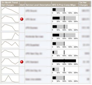
Stephen Few designed the Bullet Graph as a way to display measurements vs. goals or other benchmarks. The screen shot below shows bullet charts in the column “MTD & Proj Comp MAgo” (Month to Date and Projected Expense Compared to Month Ago).

by Kurt Wolff
An OBIEE dashboard designer recently asked how to turn a prompt for a single month into a filter for a range of months. For...
by Kurt Wolff
An OBIEE dashboard designer recently asked how to turn a prompt for a single month into a filter for a range of months. For example, if the user selects “Aug” in the prompt, the results should include not just August but also the three months preceding and following August (i.e. May through Nov).
by Kurt Wolff
One of the tricky things for users of relational databases is forming queries without overstating (or understating) results...
by Kurt Wolff
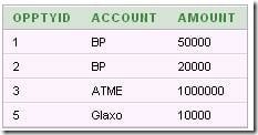
One of the tricky things for users of relational databases is forming queries without overstating (or understating) results as a consequence of table joins.
by Kurt Wolff
Linear regression is a statistical technique for drawing a line through a set of data points that “best fits” the data. It...
by Kurt Wolff
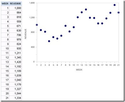
Linear regression is a statistical technique for drawing a line through a set of data points that “best fits” the data. It is a useful and standard technique for quantifying trends.
by Kurt Wolff
One of the questions that comes up over and over again is how to show all periods in a query when facts don’t exist for all...
by Kurt Wolff
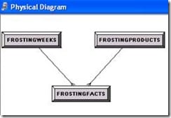
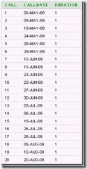
One of the questions that comes up over and over again is how to show all periods in a query when facts don’t exist for all periods or how to show all products when facts don’t exist for all products.
by Kurt Wolff
[Note: the following discussion is based on OBIEE version 10.1.3.4.0 and Oracle XE version 10G, both running on Windows. The...
by Kurt Wolff
[Note: the following discussion is based on OBIEE version 10.1.3.4.0 and Oracle XE version 10G, both running on Windows. The behavior of other versions of OBIEE could be different.]
by Kurt Wolff
Here’s a not uncommon scenario. You are designing a dashboard page with a report such as sales by customer. To show sales by...
by Kurt Wolff
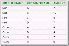
Here’s a not uncommon scenario. You are designing a dashboard page with a report such as sales by customer. To show sales by customer, you design a report containing the CustomerName column so that facts are grouped by customer. You provide a multi-select prompt to allow the user to select which customer data to view. But you also want to provide the ability to view the data for all customers as a total, without grouping by customer.
by Kurt Wolff
Here is a technique for enabling the user to set join columns with a dashboard prompt.
by Kurt Wolff
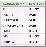
Here is a technique for enabling the user to set join columns with a dashboard prompt.
by Kurt Wolff
The Ago() “time series function” can be used to show data for a previous time period, as long as the previous time period...
by Kurt Wolff
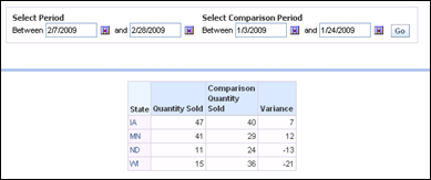
The Ago() “time series function” can be used to show data for a previous time period, as long as the previous time period corresponds to a level that has been defined in the period hierarchy. A typical period hierarchy containing day, month, quarter, and year levels would allow you to use the Ago function to construct measures showing data for day ago, month ago, quarter ago, year ago (or N days ago, N months ago, etc.).


by Kurt Wolff
If you have tried to develop dashboards or coherent sets of reports as an analytic application, you have had to think about how best to structure a web catalog.
by Kurt Wolff
Stephen Few designed the Bullet Graph as a way to display measurements vs. goals or other benchmarks. The screen shot below shows bullet charts in the column “MTD & Proj Comp MAgo” (Month to Date and Projected Expense Compared to Month Ago).
by Kurt Wolff
An OBIEE dashboard designer recently asked how to turn a prompt for a single month into a filter for a range of months. For example, if the user selects “Aug” in the prompt, the results should include not just August but also the three months preceding and following August (i.e. May through Nov).
by Kurt Wolff
One of the tricky things for users of relational databases is forming queries without overstating (or understating) results as a consequence of table joins.
by Kurt Wolff
Linear regression is a statistical technique for drawing a line through a set of data points that “best fits” the data. It is a useful and standard technique for quantifying trends.
by Kurt Wolff
One of the questions that comes up over and over again is how to show all periods in a query when facts don’t exist for all periods or how to show all products when facts don’t exist for all products.
by Kurt Wolff
[Note: the following discussion is based on OBIEE version 10.1.3.4.0 and Oracle XE version 10G, both running on Windows. The behavior of other versions of OBIEE could be different.]
by Kurt Wolff
Here’s a not uncommon scenario. You are designing a dashboard page with a report such as sales by customer. To show sales by customer, you design a report containing the CustomerName column so that facts are grouped by customer. You provide a multi-select prompt to allow the user to select which customer data to view. But you also want to provide the ability to view the data for all customers as a total, without grouping by customer.
by Kurt Wolff
Here is a technique for enabling the user to set join columns with a dashboard prompt.
by Kurt Wolff
The Ago() “time series function” can be used to show data for a previous time period, as long as the previous time period corresponds to a level that has been defined in the period hierarchy. A typical period hierarchy containing day, month, quarter, and year levels would allow you to use the Ago function to construct measures showing data for day ago, month ago, quarter ago, year ago (or N days ago, N months ago, etc.).
