by Kurt Wolff
Linear regression is a statistical technique for drawing a line through a set of data points that “best fits” the data. It is a useful and standard technique for quantifying trends.
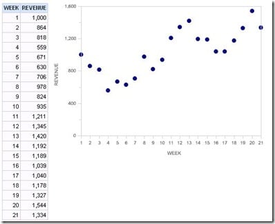
For example, consider the following sample data set, graphed as a simulated dot plot in OBI EE.
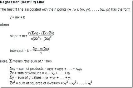
Fitting a regression line is a two-step process: finding the slope of the line and finding the y-intercept (where the regression line would cross the y axis).

If you don’t remember the formula for determining the slope from the statistics class you took 10 to 40 years ago (!), you can easily find it with a search on the web. This site has this:
You can calculate this formula directly in Answers. I recommend doing it term by term, using a different calculated column for each term in the formula and then combining terms at the end.
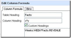
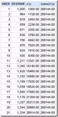
Click on any column in the left panel to get a column to write the first term of the formula in. Here, the column clicked was Revenue.
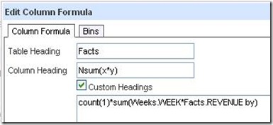
The first term will be x*y. I label the column headings to correspond to the formula I am building.
Then add another column to continue building the formula, using the Column button in the formula window to pick the x*y column already built. This technique saves a lot of headaches down the road as the formula becomes more complex and you start hunting down unmatched parentheses.
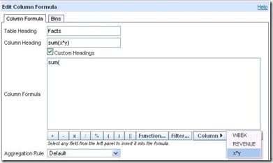
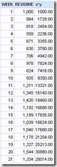
Clicking on x*y gives this formula.
It is useful to look at results for each step along the way. In this case, the results are not what are needed.
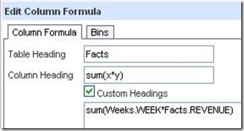
So the formula needs to be modified. I added the “by” clause to get the sum for all rows.
State: HY000. Code: 10058. [NQODBC] [SQL_STATE: HY000] [nQSError: 10058] A general error has occurred. [nQSError: 15036] Logical table Facts needs a primary key to support count aggregates on that table. (HY000)
However, instead of creating fact table keys, calculate the count another way. The following formula appears to work (but oddly, as we’ll see, only for a while).
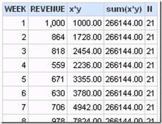
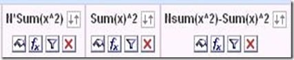
Continue building.
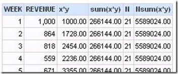
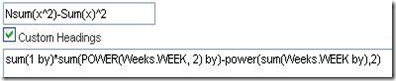
Tip: Use the Power() function in your formulas when you can.
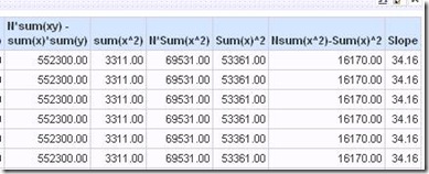
Now, the odd thing mentioned above happens. All these columns compute.
However, when you subtract the last column from the next to last to get the denominator in the formula, Answers throws a puzzling error.
State: HY000. Code: 10058. [NQODBC] [SQL_STATE: HY000] [nQSError: 10058] A general error has occurred. [nQSError: 22023] An arithmetic operation is being carried out on a non-numeric type. (HY000)
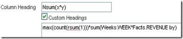
At least one of the two numbers in the final column is now regarded as non-numeric?
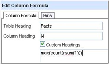
A solution to this seems to be to change the formula for N, which was max(count(rsum(1))). Both max(rsum(1)) or sum(1 by) work.
When you have the numerator(the first column in the following screen shot) and denominator (next to last column) built, calculate the slope.
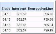
To plot the regression line, you also need the y intercept. The Criteria tab already has all the terms you need to plug into the intercept formula.
Once you have the slope and intercept, the regression line (values of y vs x) are easily calculated with the formula y=mx+b explained above (m is the slope, b is the y-intercept).
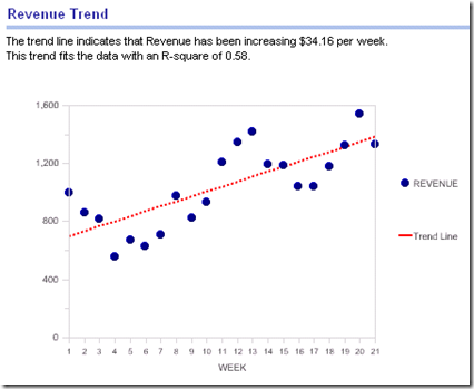
The plot looks like this:
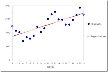
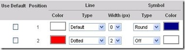
This is a line chart. Revenue is shown with blue round symbols and a 0 pixel line width. The regression line is a red dotted line with symbols turned off.
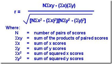
Another statistic that is important is the R-squared statistic, which measures how well the regression line fits the data. The formula for R (the correlation coefficient) is:
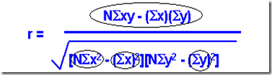
The Criteria tab already contains the formula for the numerator and several terms of the denominator (circled in this picture).
Build the rest needed for the denominator, then calculate R and finally R-squared.
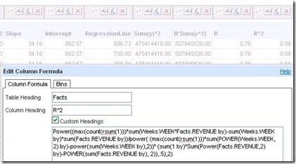
The final value, 0.58, is the goodness of fit (goodness ranging from 0, bad, to 1, perfect).
At this point all the unneeded columns can be hidden or deleted.
It is always good to translate this into business (i.e. not statistical terms) by renaming things (“Regression” –> “Trend”) and using the narrative view to spell things out as explicitly as possible. Perhaps you can come up with a good business translation for R-square.