by Kurt Wolff
The Ago() “time series function” can be used to show data for a previous time period, as long as the previous time period corresponds to a level that has been defined in the period hierarchy. A typical period hierarchy containing day, month, quarter, and year levels would allow you to use the Ago function to construct measures showing data for day ago, month ago, quarter ago, year ago (or N days ago, N months ago, etc.).
However, sometimes there is the need to compare facts in arbitrary time periods. For example, if an analyst wanted to compare sales from March 19 to March 23 2008 with sales during the period March 30 to April 12 2009 (not entirely fanciful – these were the two weeks before Easter in the United States in 2008 and 2009), the Ago function is not a solution.
In addition, use of the Ago function requires you to define separate measures for all levels, Ns, and base measure combinations that you might want to use. So if you had the base measures Quantity Sold and Amount Sold you could end up with separate measures for Quantity Sold Week Ago, Quantity Sold 2 Weeks Ago, Quantity Sold 3 Weeks Ago, …, Quantity Sold Month Ago, Quantity Sold 2 Months Ago, …, Quantity Sold Year Ago, Quantity Sold 2 Years Ago, … and the same for Amount Sold and every other base measure. In addition, you might define variances or % Change measures around each of these combinations – i.e. Quantity Sold % Change vs. Week Ago, vs. 2 Weeks Ago, vs. 3 Weeks Ago, ….
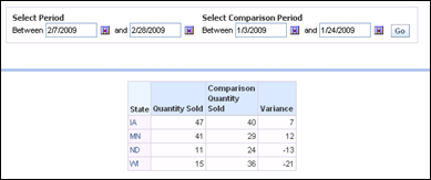
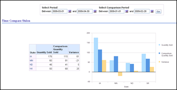
This post is about designing a dashboard page that provides an easy way for users to select an arbitrary time period and an arbitrary comparison time period and have the measures aggregated over those two time periods along with variance or % Change calculations. The basic functionality would look like this to the user. The user sets values in a dashboard prompt for the base period (for example, 2/7/2009 through 2/28/2009). Then he/she selects the comparison period (for example, 1/3/2009 through 1/24/2009. Then he/she clicks the Go button in the prompt.
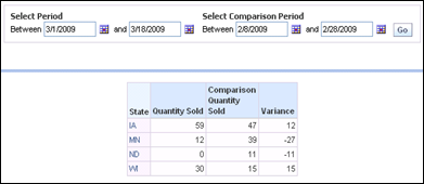
Or the user could compare the period from 3/1/2009 through 3/18/2009 with the period from 2/8/2009 through 2/28/2009.
There are several approaches you might think of to provide a working solution. I’ll discuss two here, but there might be others.
The first involves creating two separate queries that have two different time constraints, unioning the results together, and then combining results using a pivot table.
There are some downsides to using a union, because with a union you give up navigation, you give up column selectors, you give up calculating a % Change, and you will have some deficiencies with charts. The upside is it needs only a simple change in the metadata.
Using A Union (“Combining Similar Queries”)
This approach seems to work best if you create a second presentation column to enable setting two period constraints in a dashboard prompt.
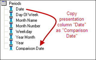
Build a dashboard prompt having both “Date” and “Comparison Date” using the “is between” Operator with both.
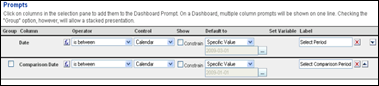
Build a dashboard prompt having both “Date” and “Comparison Date” using the “is between” Operator with both.
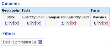
The column formulas are
Geography.State,
Facts.”Quantity Sold”,
0,
Facts.”Quantity Sold”.
Click “Combine Similar Queries” and construct the second query(you can take a shortcut here by copying the original query). In the second query, change the filter to use the Comparison Date column.
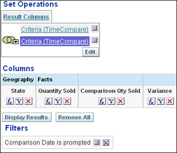
The column formulas in the second query are Geography.State,
0,
Facts.”Quantity Sold”,
-Facts.”Quantity Sold”.
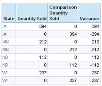
When you run the query (no constraints having yet been set on dates), you end up with something like this:
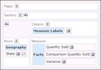
Then use the pivot table view to sum up the columns, grouping by the common non-aggregatable column values. Be sure to set the aggregation rule for each fact column (aggregation = sum).
If you want to chart the results, you may need to use the pivot table chart view.
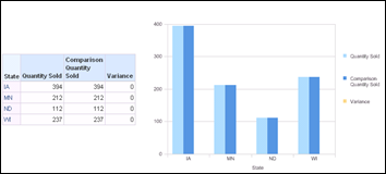
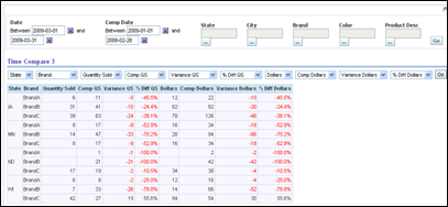
This is how it looks on the dashboard after date values have been entered.
Second Period Dimension and Fact Table Alias
Another approach is to introduce a second period dimension and an alias of the fact table. This requires more metadata work but you end up getting back all the features you forego with unions. Unions (and the other set operation queries using intersect and minus operators) were supposed to become “first class query citizens” several years ago, but have not made it (yet). In the meantime, we need to find other approaches. The steps are outlined here.
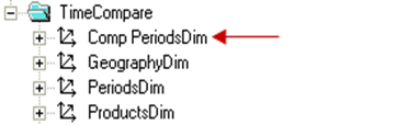
Create new aliases of the period table and fact table.
Create physical joins. The table TIMECOMPAREPRODUCTS and TIMECOMPAREGEOG were the existing product and geography tables.
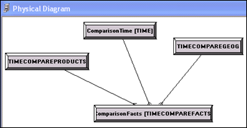
Add the second period table to the business model, including the logical joins.
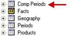
Add a second period dimension to the business model.
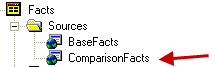
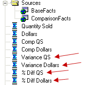
Add a new logical fact table source.
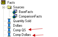
Create new comparison base measures and map them into comparison logical fact table source.
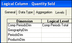
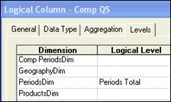
Because the new period dimension does not relate to all facts (nor, now, does the old period dimension) , set the level attributes of the base and comparison measures to the Total level for the dimension that does not relate to them.
More than likely, you will want to create variance and % Change measures.
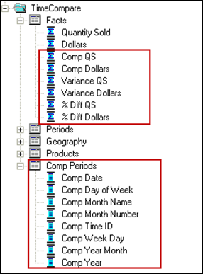
Add the new objects to the presentation layer.
You can now create dashboard pages that support arbitrary time comparisons along with regular navigation and drilling. Combining this with column selectors, the dashboard page gives users a lot of latitude to do the analyses they need without using Answers.
Put something like this together and, if you are curious, see how simple the resulting SQL is compared to what happens with the Ago function!